Designing clearer workflows for volunteers and administrators within a nonprofit's internal platform

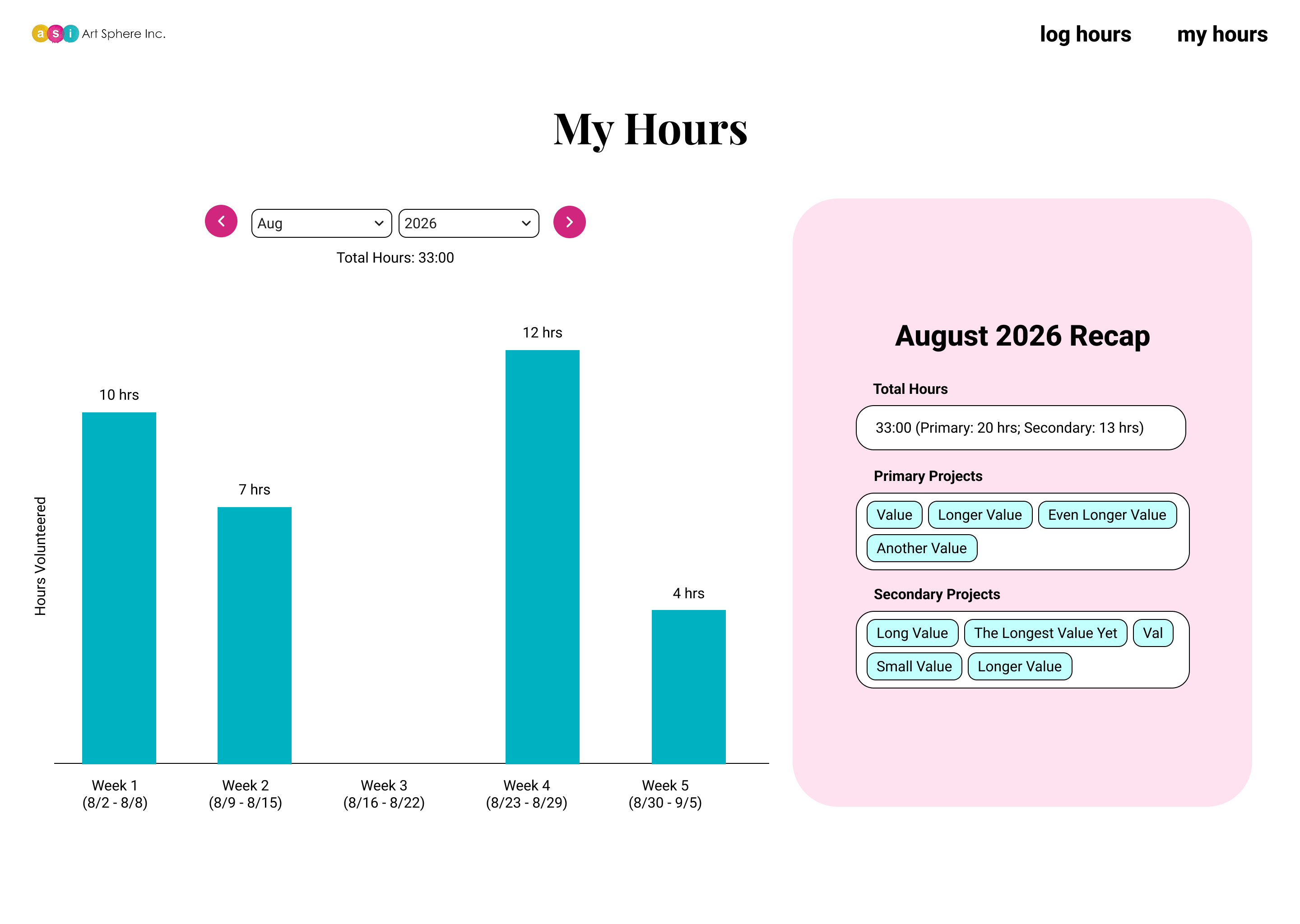
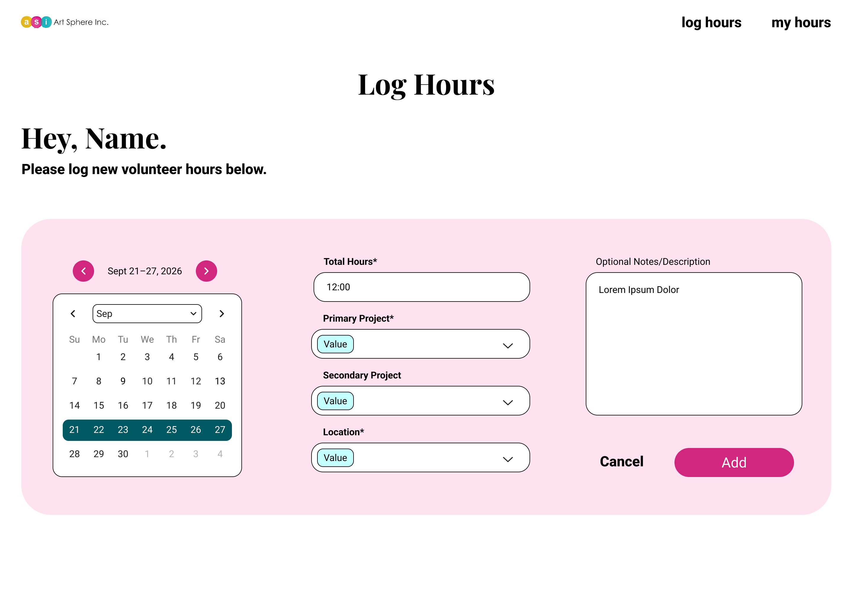
Art Sphere needed a centralized intranet experience for volunteers to record their service hours and describe their contributions. Administrators also needed to review existing records, filter volunteer hours, and log hours on behalf of volunteers when necessary.

My focus was the UX research and design of the time-tracking experience, with particular attention to making time-entry forms easier to understand and clarifying the distinction between volunteer and administrator workflows.

Project Info
‍Role
UX Researcher and Designer
Team
Loan Pham,
Vandan Patel
Yengkee Chand
Methods
Remote usability testing
‍
Output
Microsoft SharePoint intranet
Project Type
The Problem

Volunteer time tracking involves more than entering a number of hours.

Users need to understand which information is required, how their work relates to a project, and what happens when they submit an entry.

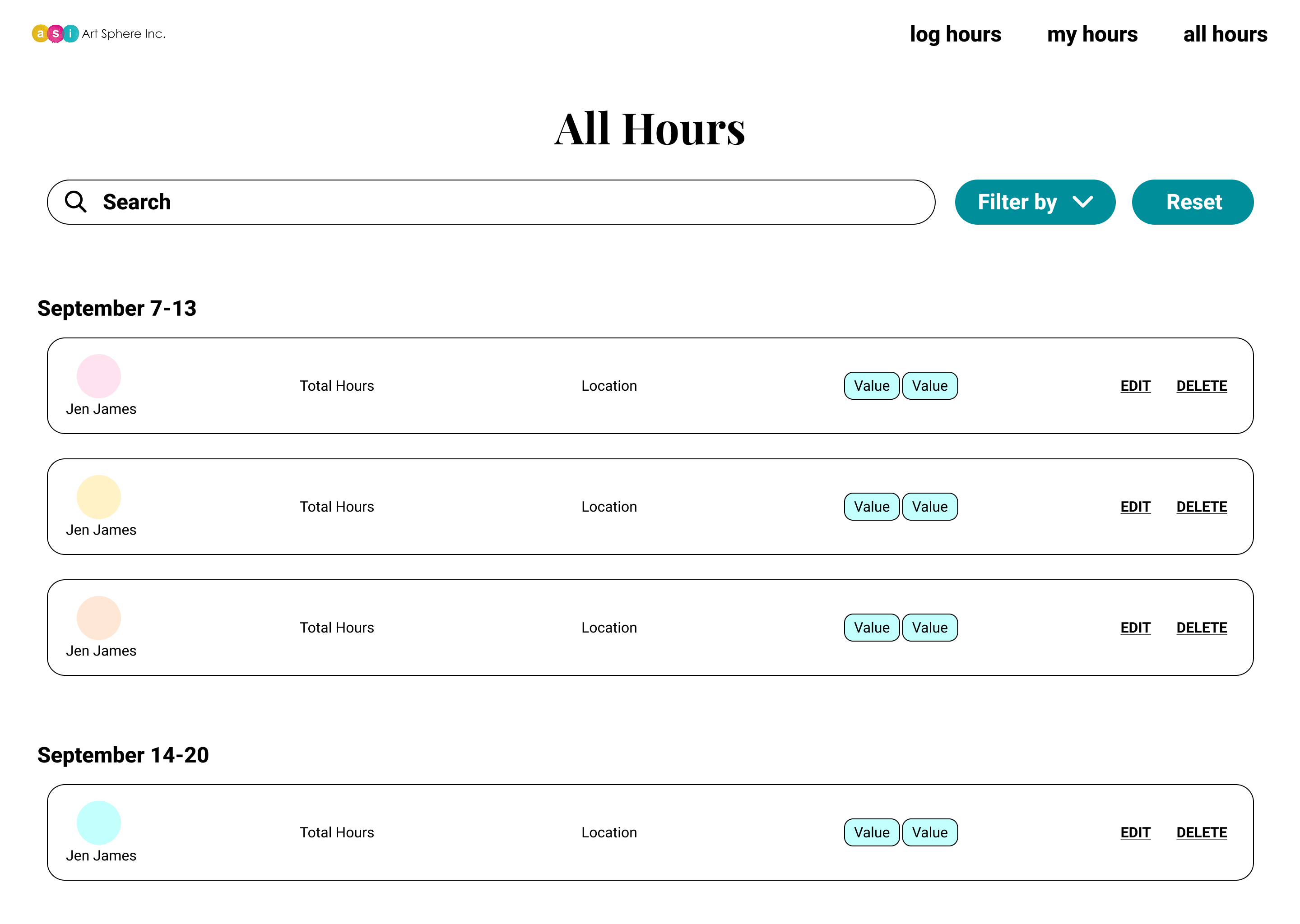
Administrators have additional responsibilities. They need to distinguish between reviewing existing records and creating entries on behalf of volunteers.
The design challenge was to make these workflows understandable without requiring users to learn the system's internal logic before completing their tasks.
Design Process

A focused approach shaped by product requirements and usability testing.

01. Understanding the requirements
I used the PRD and guidance from the design lead to understand the required functionality, user roles, and time-tracking workflows. This established the foundation for the design and helped clarify the needs of volunteers and administrators.
02. Testing usability
I conducted a remote usability test to evaluate the volunteer directory and time-tracking experience. The session revealed friction around project selection, required fields, action labels, and administrator navigation.
03. Refining the experience
I used the usability findings to identify opportunities to improve the time-entry form and clarify administrator workflows. The focus was on making field requirements more explicit, using clearer terminology, and connecting related actions.
04. Designing the interface
I translated these requirements and findings into interface design decisions, focusing on form hierarchy, field labels, project selection, navigation, and visual clarity.
Key Decisions

Design refinements informed by usability findings and user needs.

Simplifying time entry
Clarify primary and secondary project selection, distinguish required from optional fields, and make submission actions more explicit.
Improving administrator workflows
Differentiate reviewing existing records from logging hours on behalf of volunteers, with clearer navigation and a contextual action to create entries.
Strengthening visual clarity
Use descriptive labels, consistent form conventions, and readable typography to reduce ambiguity.
Reflection

Key insights into improving clarity, navigation, and time-tracking usability

Usability testing indicated that the core workflows were generally understandable, while terminology, form hierarchy, and navigation presented opportunities for improvement.

This project reinforced the value of connecting usability findings to practical design decisions and balancing user needs with the constraints of an existing internal platform.

Dariel Tatiana Davis ©2026